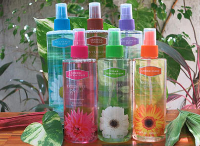
 Known for working closely with their customers, Jean Philippe saw the need to improve on their product label, ultimately this would improve on their customer experience. Jean Philippe reached out to Netpack to handle and improving an already existing design. Having been their primary label vendor. There was an urgent need to create a new line of labels that would showcase the colorful design and printing technologies on both sides of the bottle inside and outside the label. Jean Philippe wanted a solution that would allow consumers to see into and through their containers. They also wanted to update their label to include embellishments (foil) that would increase shelf appeal but still keep true to their original branding.
 Netpack recommended that the images would be reversed with the original clear Bottles. The Label would allow consumers to see the liquid inside. In addition, to emphasize the qualities of the product. Netpack designers suggested that the container have a printed label on the back that would allow consumers to “see through” the liquid inside and see the
Printed image on the opposite side of the bottle.
Netpack recommended that the images would be reversed with the original clear Bottles. The Label would allow consumers to see the liquid inside. In addition, to emphasize the qualities of the product. Netpack designers suggested that the container have a printed label on the back that would allow consumers to “see through” the liquid inside and see the
Printed image on the opposite side of the bottle.
These design elements presented a small challenge due to the fact that the properties of both the container and the liquid inside could cause readability issues. The material properties of the container and the viscosity of the liquid inside could distort the text on the label. With Netpack's previous experience, this challenge was easily met. The label was designed in eight colors. The labels were created in such a way that the customer could view the image from inside the bottle. This turned a simple redesign into a very complicated project.
The solution to this challenge, Netpack printed a silkscreen quality white over the reversed image, this enabled to then print the original four color image without any issue of bleeds or color variations.
Netpack has talented prepress and pressman that made the process run smoothly.
Netpack has the ability to see solutions to a problem that otherprinters cannot. They are not simply applying ink to a substrate. They create answers that help their customers reach their goals. Netpacks creative solutions was so successful that the entire line was converted and produced using the reverse image printing process. The label experts at Netpack were able to produce a product that kept true to Jean Philippe's Fragrances branding, while enhancing their product with innovative embellishments, compensating for difficulties in materials, and providing the correct solution.
Founders of Intimate Secret attributed the success of the project the fact that Netpack appreciates the customer service aspect of what a business needs and it shows with their prompt communication. They were glad to say that whenever they had questions on current products or strategizing for a new launch, Netpack was always available to provide solutions.

