
How to design product packaging that sells in 5 easy steps: The most important consideration in product design is your customer. You must understand the customer’s needs and wants. One of the best ways to get inside your customer’s mind is to draw an empathy map.
The 5 Stage Packaging Process
DISCOVERY
Stage 1:
1. Empathy Mapping
2. Creative Brief
3. Visual Audit
CREATION
Stage 2:
1. The Message Pyramid
2. Visual Ideation
REFINEMENT
Stage 3:
On natquis niminve litatatat eat dus sit, quae explique exererspici des eum atesti ium ulpa con nobis ut quod. Odignim aximenda doluptasped explign
IMPLEMENTATION
Stage 4:
On natquis niminve litatatat eat dus sit, quae explique exererspici des eum atesti ium ulpa con nobis ut quod. Odignim aximenda doluptasped explign
PRODUCTION
Stage 5:
On natquis niminve litatatat eat dus sit, quae explique exererspici des eum atesti ium ulpa con nobis ut quod. Odignim aximenda doluptasped explign
Empathy Mapping
 The most important consideration in product design is your customer. You must understand the customer’s needs and wants. One of the best ways to get inside your customer’s mind is to draw an empathy map.
An empathy map is a collaborative tool teams can use to gain a deeper insight into their customers. Much like a user persona, an empathy map can represent a group of users. Ask the questions, such as what your customer is:
- thinking & feeling about their worries or aspirations?
- hearing while using our product, from their friends or boss?
- seeing while using our product in their environment?
- saying & doing while using our product in public or in private?
- experiencing as a pain point or fear when using the product?
- experiencing as a positive or gain when using our product?
Creative Brief
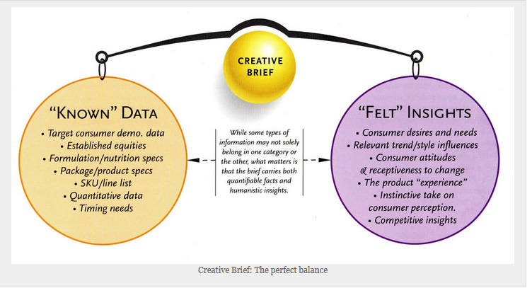
When creating the creative brief, it is important to balance the research data with intuition and instinct.
Research and consumer testing take several common forms: brand DNA or essence testing, quantitative and qualitative interviewing, focus groups, commercial eye-tracking, in-home user tests (IHUTs), and so on. Choosing among them is a mixed methodology beginning with the identification of what knowledge is sought. Once this is identified, appropriate research formats can be chosen, but time and budgetary limitations are almost always big factors.
The key to getting the most out of research is balance; research must be used in conjunction with intuition and instinct.
Today’s business climate often inadvertently discourages placing much weight on instinct and gut feelings because Wall Street wants proof, not hypothesis. The typical corporate environment is understandably risk-adverse. Unfortunately this culture means product parity and me-too positioning. Data and findings compiled during research are vital to measuring buying habits, opinions, and needs, but do not give birth to break away ideas.
Properly interpreted, research can either validate or cast doubts on formed opinions and strategies. Combining instinct with research results can prevent an idea or design from falsely being labeled new or wrong simply because it is unfamiliar.
Visual Audit

Effective audits involve surveying multiple environments in which a package is merchandised or promoted. The focus should be on the channels with the greatest exposure to the target consumer, but when possible, secondary or more obscure locations should be studied as well. Sometimes advantages can be recognized and shares gained in less obvious places. In the primary product arena, objectivity is key when noting strengths and weaknesses. It is also important to observe similar environments in multiple markets. This will help identify common competitive factors and the presence of uncontrollable factors such as merchandising, lighting, and categorical clutter.
Environmental Factors
An audit should also note key environmental factors, ranging from macro to micro, that have impact from the moment a consumer enters a store. Of critical note are the following:
a) Category location within the store.
Hard to find? Impulse? Back of the store?
b) Neighboring product categories.
When observring your product, what’s in your periphery? Does it matter?
c) Product slotting within the category.
Centarl or fringe? Common neighbors? Top shelf or floor level?
d) Scope of direct competition within the category.
Multiple shelves/facings? What do the competitors own (color, messages, package shape, etc)?
e) Multiple SKU/line extensions.
If your product is part of a line, how identifiable are individual SKUs? Do they sufficiently differentiate within your line and from the competition?
f) Stopping power.
Does the product stand out or recede? Leader or me-too?
g) Additional marketing factors.
Promotions within the category? Shelf talkers or other merchandsining or sinage? Noteworthy price disparities with direct competitors?
h) Presence of private label.
Generics, copycats, or premium store brands? JUNE 2015
The Message Pyramid
A well-planned messaging hierarchy involves more than listing features and benefits in order of importance. It must also acknowlege the relationship between various messages.
well-planned messaging hierarchy involves more than listing features and benefits in order of importance. It must also acknowlege the relationship between various messages. Strictly crafting a package with a message hierarchy represented in order and/or by relative scale will lead to message overload and clutter. When elemnts are grouped by both sensible copy development and visual compartmentalization, a well-designed package can say all.
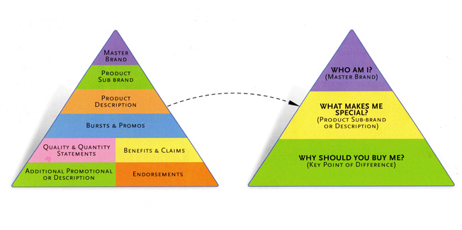
To help keep messaging effective, each elements should speak to the following three agendas:
1. Vision and purpose: Who am I?
2. Conflict and opportunity: What makes me special?
3. Reception and acceptance: Why should you buy me?
Below: The chart (bottom left) shows how too much communication can clutter and distract from the three key messages. Instead, combine and synergize the elements into a more cohesive display (bottom right).
Visual Ideation
Creating package design that achieves the objectives of a brief requires several interpretive disciplines. First the design firm’s creative director must be effective at translating the brief into an inspired creative vision for the team. That direction must both harness the creative team’s energy toward a targeted solution and allow for the development of an array of packaging solutions that meet and stretch expectations.
What is too far? The boundary should not lie just at the edge of what’s comfortable. Simply hitting the brief with a solution that feels right and looks appropriate often produces more fo the same and lacks impact.
Brainstorming
What do you envision when you close your eyes and imagine a brainstorm? The term implies an indiscriminate variety of thoughts and concepts rapidly swirling around, fueled by the infinite imaginative power of the mind. Starting the storm requires a temporary removal of predetermined barriers and a suspension of conventional thought. In order to come up with new or refreshing ideas, people must set aside common preconceptions and expectations. When possible, having designers, creative directors, marketeres, and business managers deep dive together at the onset of a new packaging program produces not only a broader array of ideation, but also forms a collaborative synergy across multiple disciplines that can fuel positive change (and lower risk aversion) throughout the entire campaign.
Conceptual Ideation
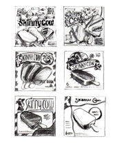
Early concept development and ideation is best shown in black-and-white sketch form. Sketches provide just enough visual information to communicate an idea, graphic architecture, and space planning.
Such roughs force people to look beyond specifics. Keeping an early focus on the root idea allows the conceptual cement to dry as a solid foundation for the steps ahead.
CASE STUDY:
Skinny Cow
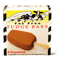
Skinny Cow, a healthful alternative to full-fat ice cream, had a loyal consumer base. To expand its reach and attract new customers, a redesign was in order along with revitalizing the cow character, but not at the cost of losing its cult following. Above is the package prior to the redesign.
Brainstorming
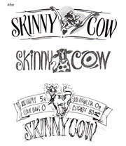
Initial focus was placed on refining the Skinny Cow brand personality. Who was she to consumers? What potential lay in enhancing her role on the package? The design exporation included Skinny the Cow in a variety of expressive roles integrated within the prototype.
Conceptual Ideations
Rough conceptual approaches allow ideas to freely be explored without the commitment of hours in implementing a full-color concept.

